
Home → Blog → Restaurant Growth → Restaurant Menu Design Psychology: How Customers Choose
Restaurant Menu Design Psychology: How Customers Choose
Your menu isn't just a list of food and prices. Layout, descriptions, photos, pricing, and organization can influence how customers evaluate their choices. Learn the psychology behind better restaurant menu design.
Restaurant Menu Design & Psychology: How Customers Choose What to Order
A restaurant menu looks simple.
A few categories.
Some food names.
Descriptions.
Prices.
Maybe a few pictures.
But your menu is doing something much more important than simply telling customers what you sell.
It's helping them make a decision.
Think about what happens when someone sits down and opens your menu.
They don't carefully analyze every item.
They scan.
They compare.
They look for something familiar.
They notice something that looks delicious.
They check prices.
They eliminate options.
Then eventually, they decide.
Research from Cornell's School of Hotel Administration notes that customers may spend only a short amount of time reviewing a restaurant menu, which means restaurants have a limited opportunity to guide attention and make choices easy.
That's why menu design matters.
A good menu doesn't manipulate customers into buying something they don't want.
It makes the decision easier, clearer, and more appealing.
And for restaurant owners, good menu design can also help important dishes get the attention they deserve.
Your Menu Is Part of Your Sales Strategy
Many restaurant owners think of their menu as an information document.
That's only half the story.
Your menu is also a sales tool.
Suppose your restaurant has 30 dishes.
Five are extremely popular.
Five are highly profitable.
Ten sell occasionally.
The remaining ten barely sell.
If every item receives exactly the same visual treatment, you're giving your customers no reason to notice the dishes you most want them to consider.
Menu engineering takes a more strategic approach.
It looks at menu items based on factors such as sales volume and profitability, helping restaurants decide which dishes deserve more attention, and which may need to be changed or removed. Cornell's hospitality research describes this as a way to categorize menu items and improve menu profitability.
Your menu isn't just showing customers what you have.
It's deciding how you present the choices.
1. Don't Put Everything on One Giant Menu
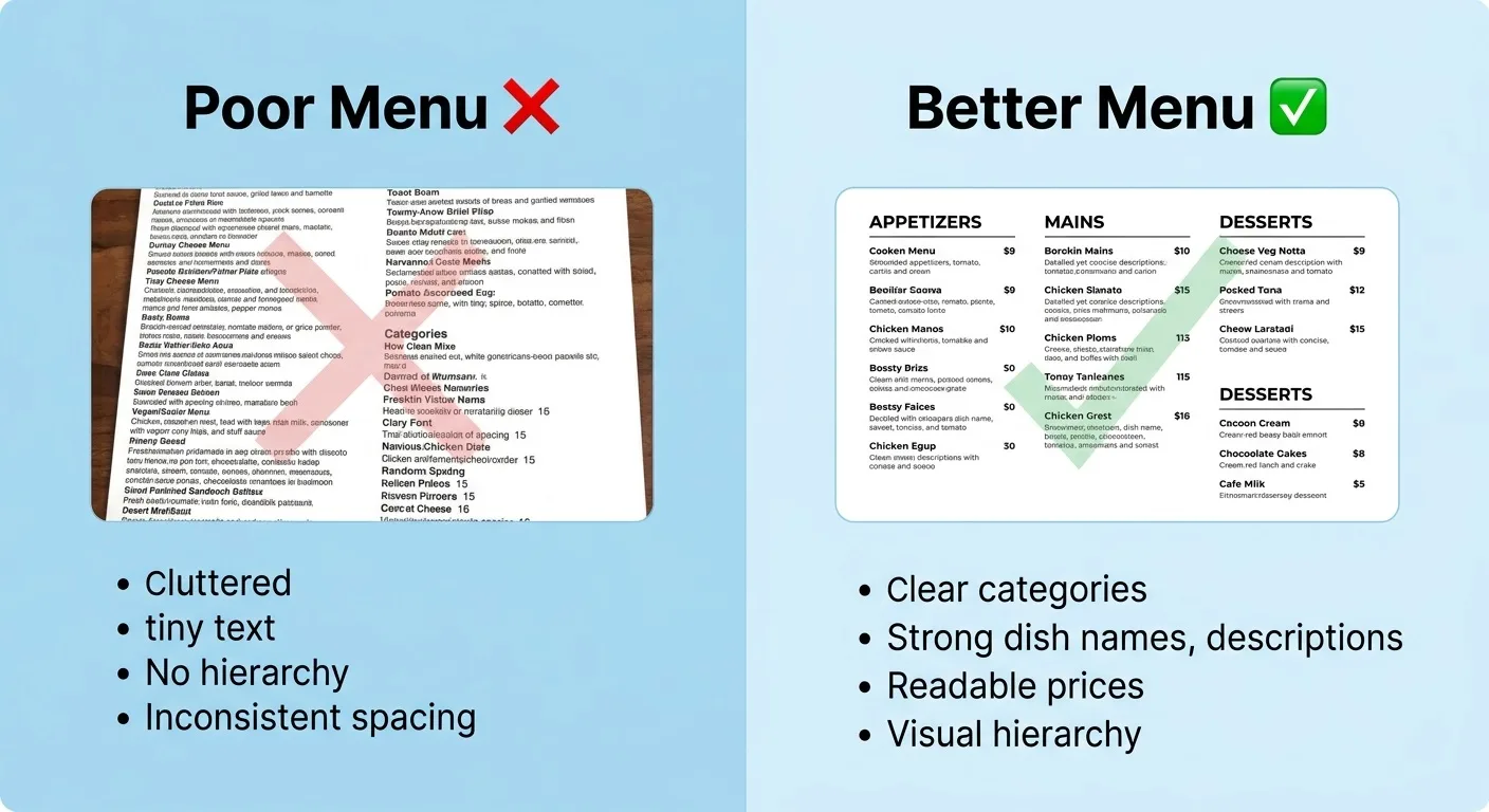
One of the easiest ways to make a menu difficult is to put everything into one enormous list.
Imagine opening a digital menu and seeing:
57 items.
No categories.
No hierarchy.
No visual separation.
Just item after item after item.
The customer now has to do the organization themselves.
That's unnecessary mental effort.
Instead, create logical categories.
For example:
Starters
Burgers
Main Courses
Pasta
Desserts
Drinks
A customer looking for a burger can immediately move to the relevant section.
This is basic information architecture, but it matters.
Research into menu-selection systems shows that organization, hierarchy, clustering, and distinctiveness are important considerations when designing systems that require people to choose among options.
The same principle applies to restaurant menus:
Make the choices easier to navigate.
2. Give Your Menu a Clear Visual Hierarchy
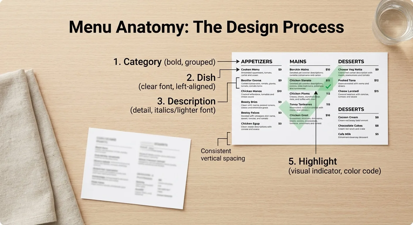
Not every piece of information should look equally important.
Your customer's eyes need somewhere to start.
A useful hierarchy might be:
Category
↓
Dish name
↓
Short description
↓
Price
You can also use visual emphasis for selected dishes.
For example:
House Special Chicken
Slow-roasted chicken served with fragrant rice, herbs, and our signature sauce.
$16
The dish name stands out.
The description explains it.
The price is easy to find.
The customer doesn't have to decode the layout.
Good design reduces friction.
3. Don't Write Boring Dish Names
Compare these:
Chicken Pasta
versus:
Creamy Garlic Chicken Pasta
The second immediately gives the customer more information.
But don't turn every dish into a ridiculous sentence.
Your description should make the food understandable and appealing, not sound like marketing poetry.
Instead of:
Chicken with sauce.
Try:
Grilled chicken tossed with creamy garlic sauce, parmesan, and fresh herbs.
The customer can imagine the dish.
That matters.
Research examining restaurant dish descriptions and visual presentation found that appealing food presentation and descriptive language can engage attention, emotion, memory, and reward-related responses.
In other words:
Don't merely identify the food. Help customers understand the experience.
4. Use Descriptions to Sell the Experience
Compare:
Beef Burger Beef patty with cheese.
with:
Smoky BBQ Beef Burger Juicy grilled beef patty, melted cheddar, crispy onions, and our smoky house BBQ sauce.
The second description gives the customer more to imagine.
You can describe:
- Texture
- Flavor
- Cooking method
- Key ingredients
- Sauce
- Toppings
- Origin
- Specialty ingredients
But keep descriptions relatively short.
Customers aren't reading a novel before ordering lunch.
A good description should answer:
What is it?
What makes it special?
Why might I want it?
5. Don't Put 10 Photos on Every Menu
Food photography can be extremely powerful.
But more isn't automatically better.
If every single dish has a giant photograph, the menu can become visually chaotic.
Instead, consider using photographs selectively.
Show:
- Signature dishes
- Best sellers
- High-margin dishes
- Visually distinctive items
- New dishes
- Special promotions
Research on restaurant menu imagery has found that appetizing pictures can influence food choices by directing attention and increasing anticipated enjoyment.
That's why one excellent photograph can sometimes be more useful than twenty mediocre ones.
Quality beats quantity.
6. Make Your Food Photos Look Like the Real Food
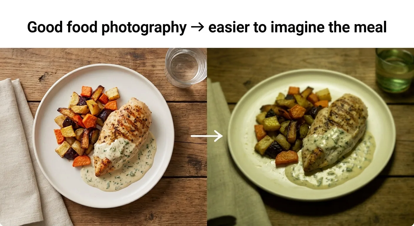
This sounds obvious, but it's important.
If your menu shows a gigantic burger covered in perfect ingredients and the customer receives something completely different, you've created a trust problem.
Your menu should make the food look appealing without creating unrealistic expectations.
Use:
- Good lighting
- Clean presentation
- Accurate portions
- Real dishes
- High-resolution images
Avoid:
- Blurry photographs
- Dark images
- Excessive filters
- Misleading AI-generated food
- Photos that don't represent what you actually serve
The goal is to make customers hungry—not disappointed.
7. Be Strategic With Your Best-Selling and Most Profitable Items
Your menu has limited attention.
So ask yourself:
Which dishes do I most want customers to notice?
Maybe it's your signature burger.
Maybe it's your family platter.
Maybe it's the dish with excellent margins.
Maybe it's a new item you're trying to introduce.
These dishes can receive stronger visual treatment.
For example:
⭐ HOUSE FAVORITE
Smoky BBQ Beef Burger
Juicy grilled beef patty, cheddar, crispy onions, and house BBQ sauce.
$14
A small visual label can help distinguish the item from the surrounding choices.
Just don't put a badge on everything.
If everything is a "Best Seller," nothing feels special.
8. Don't Make Every Price the Star of the Menu
A common menu design mistake is making prices visually louder than the food.
Imagine this:
Chicken Alfredo ............ $14
Steak Pasta .................... $18
Grilled Chicken ............... $16
Beef Burger .................... $13
If your eye is naturally jumping from item to price, you're encouraging customers to compare prices before they think about the food.
Your food should be the primary subject.
The price still needs to be clear and easy to find.
But it doesn't have to dominate the page.
Research into restaurant price presentation has found that the way prices are displayed can influence consumer spending, although the effects vary by format and context. In one Cornell study, formats containing explicit monetary cues were associated with lower spending than numeral-only formats.
The practical lesson isn't:
"Remove every currency symbol and you'll make more money."
That's too simplistic.
The better lesson is:
Price presentation is part of the overall customer experience.
Test what works for your restaurant.
Pricing is another important part of menu psychology. If you're unsure how much to charge for each dish, here's a practical guide on how to price your restaurant menu without scaring away customers
9. Don't Hide Prices
There's an important difference between not emphasizing prices and hiding prices.
Customers still need to know what they're paying.
A menu that makes customers hunt for prices creates uncertainty.
And uncertainty can make people uncomfortable.
Especially online.
If someone is deciding whether to visit your restaurant and can't find prices easily, they may simply leave.
Make pricing clear.
Just don't let the price become more visually important than the food.
10. Consider the Order in Which Customers See Items
The first few items in a category receive attention simply because they're encountered first.
That's why the order of your menu deserves thought.
You might place:
Signature dish
Popular dish
High-profit dish
Standard options
rather than randomly sorting everything.
But don't use this as an excuse to manipulate customers.
Your goal should be to help customers discover dishes they may genuinely enjoy.
A menu should feel like a helpful recommendation—not a trap.
11. Use "Anchoring" Carefully
Suppose you sell burgers for:
$11 $13 $15
Customers now have a reference point.
Now imagine adding a premium burger:
Double Truffle Burger — $24
The $15 burger may suddenly feel more moderate by comparison.
This is an example of price anchoring—a concept from behavioral economics where an initial reference point can influence subsequent judgments.
However, don't add absurdly expensive items simply to manipulate customers.
A "decoy" strategy can work in some choice environments, but restaurant research has produced mixed results. For example, a randomized trial testing price-based decoys on restaurant menus did not find a significant overall effect on the targeted choice.
So don't believe every viral menu-psychology trick you see online.
Test your own menu data.
12. Give Customers Enough Choice—but Not Chaos
Choice is good.
Too much choice can become exhausting.
Imagine choosing between:
6 burgers
versus:
46 burgers.
The second menu might sound impressive.
But customers may spend more time trying to decide.
A 2024 study of restaurant food-choice behavior found that people commonly use strategies such as looking for enjoyable meals, budget-friendly options, and familiar foods when making restaurant choices.
That tells us something useful:
Customers don't necessarily want to analyze every possible option.
They often want to quickly find something that looks:
Delicious.
Affordable.
Familiar.
Then order it.
Organize your menu around that reality.
13. Make Your Most Important Items Easy to Find
Imagine a customer opens your menu and immediately sees:
⭐ Customer Favorite
Spicy Crispy Chicken Burger
That's easy.
Now imagine the same burger is hidden somewhere between 24 other items.
Which one has a better chance of getting noticed?
Your menu should have a visual path.
You can use:
- Headings
- White space
- Cards
- Borders
- Small labels
- Photography
- Typography
- Position
- Category organization
But don't use every design trick at once.
Good design isn't about making everything loud.
It's about making the right things noticeable.
14. White Space Is Not Wasted Space
Many restaurant owners want to fit as much information as possible onto one screen or one page.
That often makes the menu harder to read.
White space gives individual items room to breathe.
Compare:
Burger Name — description — price — Burger Name — description — price — Burger Name — description — price
with a properly spaced layout where each item has visual separation.
The second is easier to scan.
A digital menu doesn't have to use every pixel.
Empty space can improve clarity.
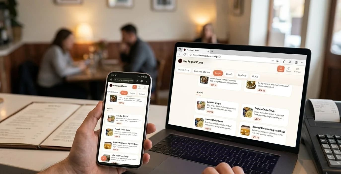
15. Design for Phones, Not Just Computers
This is especially important for modern restaurant menus.
A customer may scan a QR code at a table and open your menu on a phone.
If the menu was designed for a large desktop screen, it can become frustrating.
Customers should not have to:
- Zoom in
- Pinch repeatedly
- Scroll sideways
- Download a huge file
- Wait for enormous images
- Search through tiny text
A good digital menu should be comfortable to use with one hand on a phone.
Learn How to create website with digital menu for your restaurant without hiring a developer.
This is one major advantage of a properly designed web menu over simply uploading a photograph of a printed menu.
16. Don't Turn Your Digital Menu Into a PDF
PDF menus aren't automatically bad.
But they're often not the best experience for a mobile customer.
A web-based menu can adapt to the customer's screen.
It can be updated instantly.
It can organize categories naturally.
And it can provide a more interactive experience.
This is especially useful when dishes frequently become unavailable.
Instead of printing another menu, you can update the digital version.
With Menuberg, restaurant owners can manage their menu online and enable or disable individual items with a single click.
That means if your cheesecake sells out tonight, you don't need to redesign your menu.
You can simply switch it off.
17. Use Consistent Design
Your menu should look like it belongs to your restaurant.
Use consistent:
- Fonts
- Colors
- Image style
- Spacing
- Headings
- Buttons
- Icons
- Category structure
If your restaurant has a premium identity, your menu should feel premium.
If your restaurant is playful and casual, your menu can reflect that.
The menu is part of the brand experience.
18. Don't Sacrifice Readability for Style
A beautiful menu that nobody can comfortably read is not a good menu.
Avoid:
- Extremely small text
- Low-contrast colors
- Decorative fonts everywhere
- Text over busy photographs
- Excessive animations
- Cluttered layouts
Your customer shouldn't need to work to order dinner.
Clarity comes first.
Then style.
19. Think About Your Menu as a Customer Journey
Instead of asking:
"Does my menu look good?"
ask:
"What does a customer experience from the moment they open it?"
For example:
Step 1
They immediately understand the categories.
Step 2
They see your signature dishes.
Step 3
They find something appealing.
Step 4
They understand what's in it.
Step 5
They see the price.
Step 6
They compare it with a couple of alternatives.
Step 7
They make a decision.
That's what you're designing.
Not a poster.
A decision-making experience.
20. Test Your Menu With Real Data
This is where menu design becomes much more powerful.
Don't assume your favorite design is the most profitable.
Look at your numbers.
Which dishes sell?
Which dishes make money?
Which dishes rarely sell?
Which dishes are viewed frequently online?
Which dishes are frequently unavailable?
Which categories receive attention?
Menu engineering is specifically designed to combine sales and profitability information to support better menu decisions. Research has found that menu analysis can improve menu planning and profitability.
Your menu should evolve with your business.
If an item isn't selling, ask why.
Maybe customers don't like it.
Maybe the price is wrong.
Maybe the description is weak.
Maybe the photograph is poor.
Maybe customers simply can't find it.
The problem isn't always the food.
Sometimes it's the presentation.
A Simple Restaurant Menu Psychology Checklist
Before publishing your menu, ask:
Structure
- Are categories clear?
- Can customers find what they want quickly?
- Is the menu easy to scan?
- Is there enough visual spacing?
Food presentation
- Are your best dishes visually appealing?
- Are photographs high quality?
- Do photographs accurately represent the food?
- Are descriptions appetizing but honest?
Pricing
- Are prices easy to find?
- Are prices presented consistently?
- Does the food remain the visual focus?
- Have you tested pricing rather than relying on assumptions?
Mobile experience
- Does the menu work well on phones?
- Is the text readable?
- Are buttons easy to tap?
- Is scrolling comfortable?
- Does it load quickly?
Business strategy
- Are best sellers easy to find?
- Are profitable items given appropriate attention?
- Are slow-moving items reviewed?
- Can unavailable items be disabled quickly?
Your Menu Should Do Three Things
At the end of the day, you don't need to become a behavioral psychologist to design a better menu.
Your menu needs to do three basic things well:
1. Make the food easy to understand
Customers should know what they're getting.
2. Make the decision easy
Customers shouldn't feel overwhelmed by the layout.
3. Make the food appealing
Good descriptions, photography, hierarchy, and presentation should help customers imagine an enjoyable meal.
That's the psychology that matters.
Not tricks.
Not dark patterns.
Not hiding information.
Not manipulating people into ordering something they don't want.
Good menu psychology is about reducing friction and directing attention toward choices customers may genuinely enjoy.
And when your menu does that well, everybody benefits.
Customers make decisions more easily.
Your staff spends less time explaining the menu.
Your signature dishes get more attention.
Your online presence looks more professional.
And your restaurant has a better chance of turning a simple menu view into a real order.
Your menu isn't just a list of dishes.
It's one of the most important sales tools your restaurant owns.
Design it like one.
Ready to build your restaurant's online presence?
Menuberg helps restaurants launch a professional website and QR digital menu in minutes — no coding required.
Create Your Restaurant WebsiteRelated Articles
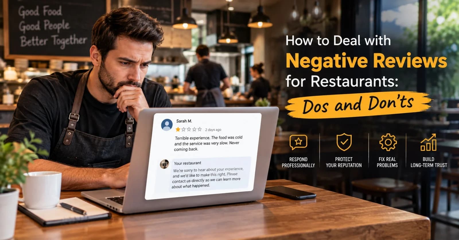
How to Handle Negative Restaurant Reviews: A Practical Dos and Don'ts Guide
A bad review doesn't have to hurt your restaurant's reputation — how you respond to it does more work than the review itself. Here's a clear, practical dos-and-don'ts approach.
6 Sept 2026 · 14 min read
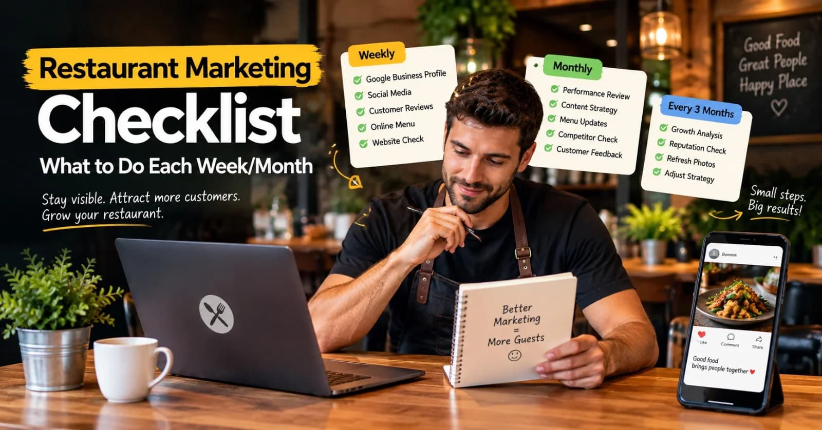
Restaurant Marketing Checklist: What to Do Every Week and Every Month
A realistic, no-burnout routine for restaurant marketing — what's worth checking weekly, reviewing monthly, and revisiting every few months, without turning it into a second job.
11 Sept 2026 · 13 min read
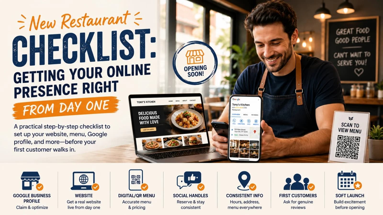
New Restaurant Checklist: Getting Your Online Presence Right From Day One
A practical, ordered checklist for getting your restaurant's website, Google profile, menu, and social presence right before, during, and after opening week — not scrambled together at the last minute.
3 Sept 2026 · 12 min read
About Menuberg
Menuberg helps restaurants create professional websites and digital storefronts without complicated setup. Learn more.